100% written by a human 
Readability

Leigh Forbes
Overview
Readability, n.
The ease with which a text may be scanned or read; the quality in a book, etc., of being easy to understand and enjoyable to read.
There are various factors that affect the readability of a text in print, with many of them involving the style and size of your typeface, the number of words/characters you have on each line, and the distance between the lines. (Another major issue can be the contrast – or lack of it – between the colour of your text and its background, but I’m going to assume you’re using black text on white or cream paper, which is, in practical terms, the only combination available when self-publishing. Fortunately, it is also a good one.)
Line Length
Called the ‘measure’ in typography, the line length is the width of a column of text. In an ordinary book, you only have one column, so this just means the width of the text between the margins. In a standard UK B-format paperback this will be around 94mm. How many characters looks best in that space line depends on your size and style of typeface (each glyph of Arial Narrow obviously takes up less space then a wider typeface like Harboro Serif).
The size of the type and width of the type measure should allow the eye to follow the line of type without strain, and easily travel back to pick up the next line; in other words, the page should be legible.
—Oliver Simon, Introduction to Typography (1945)
Note: I’m not covering the design of large- or giant-print books here, but look out for a post on this subject, and one about braille, in due course.
Characters per line
In his book, The Elements of Typographic Style ¹, Robert Bringhurst offers a ‘copyfitting’ table; this looks like an old fashioned mileage chart for distances between cities (remember those?), but instead allows you to find the optimum number of characters per line for best readability. (It can also be used to work out how many lines are needed for a given amount of text).
So what counts as ‘readable’ ?
Bringhurst’s table gives the optimum range (for justified serif text, written in English) as 64–69 characters per line, with a maximum of 85. For the minimum, he remarks, “lines averaging less than … 40 characters will lead to white acne and pig bristles: a rash of erratic and splotchy word spaces or an epidemic of hyphenation.” In short, letters should be close enough to be easily connected by the eye, but not so close that they lose their individuality.
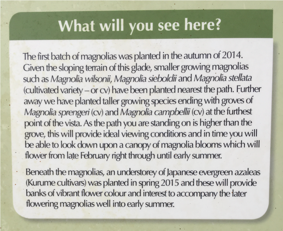
An information board at [unnamed location], illustrating perfectly what does NOT count as readable.
See also my post about Kerning.
Lower-case alphabet (LCA) length
How many letters you can fit on a line depends on the type-size (obviously), but also the font itself, and a standard way to measure a typeface is by finding the length of its lower-case alphabet (LCA). The differences can be easily seen by comparing three fonts with vastly different LCAs. (I’ve matched the x-heightsx-height:
the height of a lower-case x from top to bottom to make them directly comparable.)
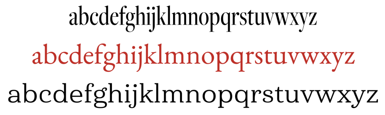
The varying lower-case alphabet lengths for Arial Narrow (top), Garamond (middle), and Harboro Serif (bottom).
Obviously, Arial Narrow is not really that readable, and would quickly get tiring. At the other extreme, Harboro uses a lot more space than is necessary (especially if you’re trying to keep your page-count down); so you’d probably opt for a typeface that falls between these two outliers – like Garamond, which has well-formed, distinct letters, and makes an efficient use of space.
Of course, I recommend you buy a copy of Bringhurst’s book for yourself (not only is it all about typography 😍 but it is also funny, and very beautiful); but if that’s not an option, you can work out the optimal character count yourself, or, if you don’t like algebra, skip to the Some popular typefaces compared table below the nerd box.
Nerd Box
To calculate the optimum number of characters-per-line in your chosen font, first measure* your line-length – the width available for text between your margins – in points (1mm = 2.835 pts). Next type out your Lower Case Alphabet plus a space, then measure that and convert its length into points too. Then plug the values into this formula² (the example given is for EB Garamond):
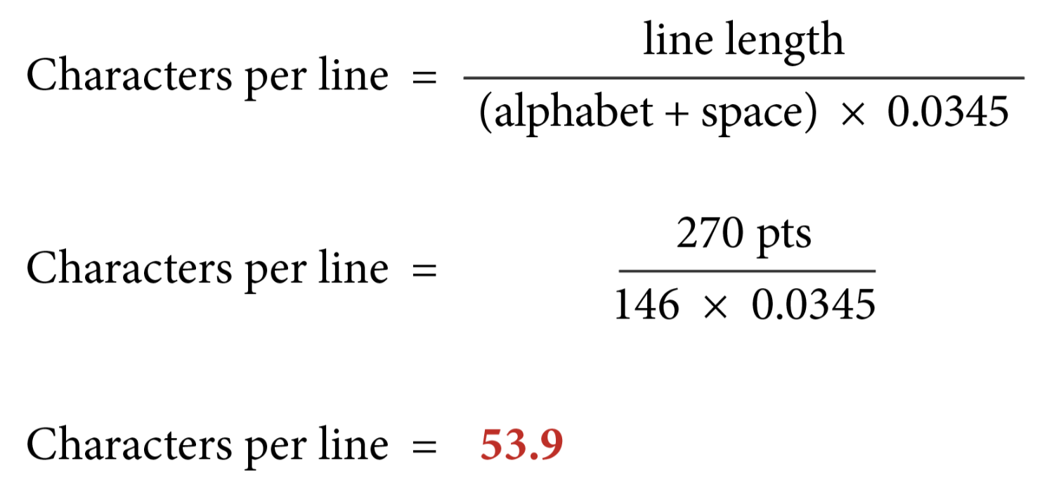
Line length in points (1mm = 2.835 pts), divided by the length of the lower-case alphabet plus a space (in points) multiplied by 0.0345. Hover to zoom.
* If you’re printing a page to make these measurements, make sure you print at 100%!
Some popular typefaces compared
Taking some popular, less extreme, typefaces, and comparing the lengths of their lower-case alphabets, the differences don’t seem all that big:

The lower-case alphabets of nine popular fonts compared.
And when their values are plugged into the formaula from the nerd box, we see only a small variation in the number of characters per line:
.| Typeface (10.5-11.5pt) | Lower Case Alphabet length (pts) |
Optimum characters per line |
|---|---|---|
| Athelas | 137 | 57 |
| Palatino | 135 | 58 |
| Sabon | 135 | 58 |
| Baskerville | 134 | 58 |
| Garamond | 129 | 61 |
| Minion | 127 | 62 |
| Charter | 127 | 62 |
| Lora | 127 | 62 |
| Times New Roman | 126 | 62 |
BUT, when you scale up these results to an 80k-word paperback, you’ll find that a book set in Athelas occupies 272 pages, Garamond 253 pages, and Times New Roman 250 pages. (And, in my opinion, four extra pages is an excellent price to pay for not having to use Times New Roman! See our post on Choosing Your Font.) So not only will your good-readability decisions make life easier for your readers, they can also save you money!
Line Height (leading)
Now you’ve worked out the perfect number of characters per line, it’s important to keep that momentum going, and make sure you use an optium line-height too. Of course, as with all other aspects of typesetting, it’s tempting to fit as many lines onto each page as possible, but the more lines you have, the closer together they will need to be, and the harder you make things for your readers: I’m not the only one who has reached the end of a line and gone to start the next one, only to find I’m reading the same line again, or have missed a line completely. Annoying, right?
The optium line-height is often quoted as being 115–150% of the font size; but that’s still a big range, illustrated by the text below. Pay particular attention to the risers (the part of a letter that rises above the x-height) and the descenders (the part of a letter that drops below the baseline).
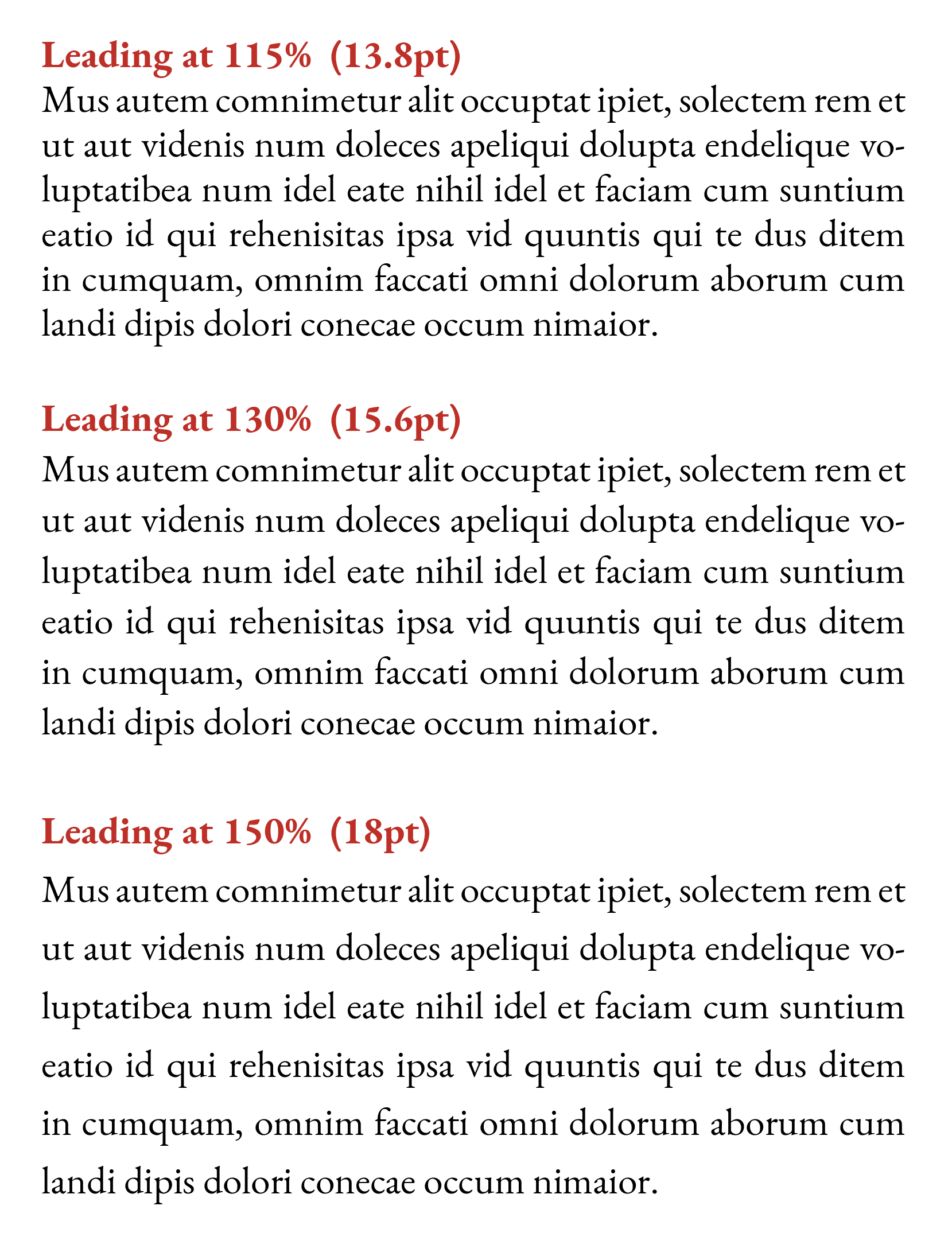
JabberwockyNonsense text used to fill a space, set in 12pt EB Garamond with three different line-heights.
In the first paragraph you can see, in the second line, the descending p and q of ‘apeliqui’ are almost butting against the rising h, l, and d of ‘nihil idel’ in the line below – which is jarring. At the other extreme, the final line of the third paragraph, has no risers at all from the l of ‘delori’ onwards, and, as there are no descenders in the words above, that’s all starting to look quite gappy. The second paragraph makes for a good compromise, so I would always recommend keeping your body text’s line-height between 120% and 140%.
¹ Bringhurst, Robert. (1992). The Elements of Typographic Style. Hartley & Marks. p.28.
² Peña, Ernesto. (2016). Calculating line length: an arithmetic approach. Visible Language. 50. 113-125.
Check out these related Posts
Hyphenation & Justification
Choosing Your Font
Tracking
Kerning
Whitespace
Blog Index
Need more help?
If you need help with this topic, or any other formatting issue, come and find me on Bluesky @writeleighso or facebook @blotpublishing
