100% written by a human 
Tracking

Leigh Forbes
Overview
Tracking and kerning both allow you to change the horizontal space between your letters and words, but for different reasons: tracking alters all the spaces in any given chunktechnical term of text (word spaces and letterspaces), while kerning alters the space only between a particular pair of glyphs (letters, numbers, symbols, spaces, etc.). These controls are easily abused, so be mindful how you use them.
It is very easy for a designer or compositor [or software presets] with no regard for letters to squish them into cattle trains and send them off for slaughter.
—Robert Bringhurst, The Elements of Typographic Style
BE AWARE: word-processing software often offers only clunky preset-values for tracking (might be called ‘character spacing’ – condensed or expanded), with no fine-tuning, usually resulting in text that looks worse, not better. How would you like your text to be spaced? Normal, crushed, obliterated, baggy, or making a break for freedom? Use with caution.
Tracking
Tracking (so called, because early phototypesetting machines used a track-mounted prism to control the placement of the text) is built into your software (layout software does it better better than a word-processor). It works by assessing your chosen font and font size, and adjusting the spacing to an optimum value (larger point-sizes will be spaced more widely than smaller ones). If you’re happy with how your software has rendered your font (print a couple of pages at 100% to check) go with it; but if it looks to tight or too loose – or you have widow/orphan problems (see below) – try tweaking the horizontal spacing a little (just a little). If your software doesn’t let you fine-tune the tracking, it might be better to leave things as they are, or look for a different font. Good quality fonts should track better than cheap or free ones. (See also Choosing Your Font)
Note, horizontal spacing is also affected by your hyphenation and justification settings, so make sure you have finalised those before thinking too much about the tracking.

Examples of how tracking affects text. Hover to zoom.
Widow / Orphan Control
If you can keep it subtle, managing widows and orphans by tweaking the tracking is perfectly okay (don’t tell the purists) as long as you have reasonably fine control over it. If your tracking options only come with clunky pre-sets (see ‘Be Aware’ box. above), you might be offered options like “keep lines together” or “widow/orphan control” instead, but these aren’t book-friendly either: all they can do – when encountering a widowWIDOW:
The last line or word of a paragraph on its own at the top of a new page or an orphanORPHAN:
The first line of a new paragraph on its own at the bottom of a page – is push a line onto the next page, leaving blank space in their wake.

A widowed line (bordered red), on its own at the top of a page. Hover to zoom.
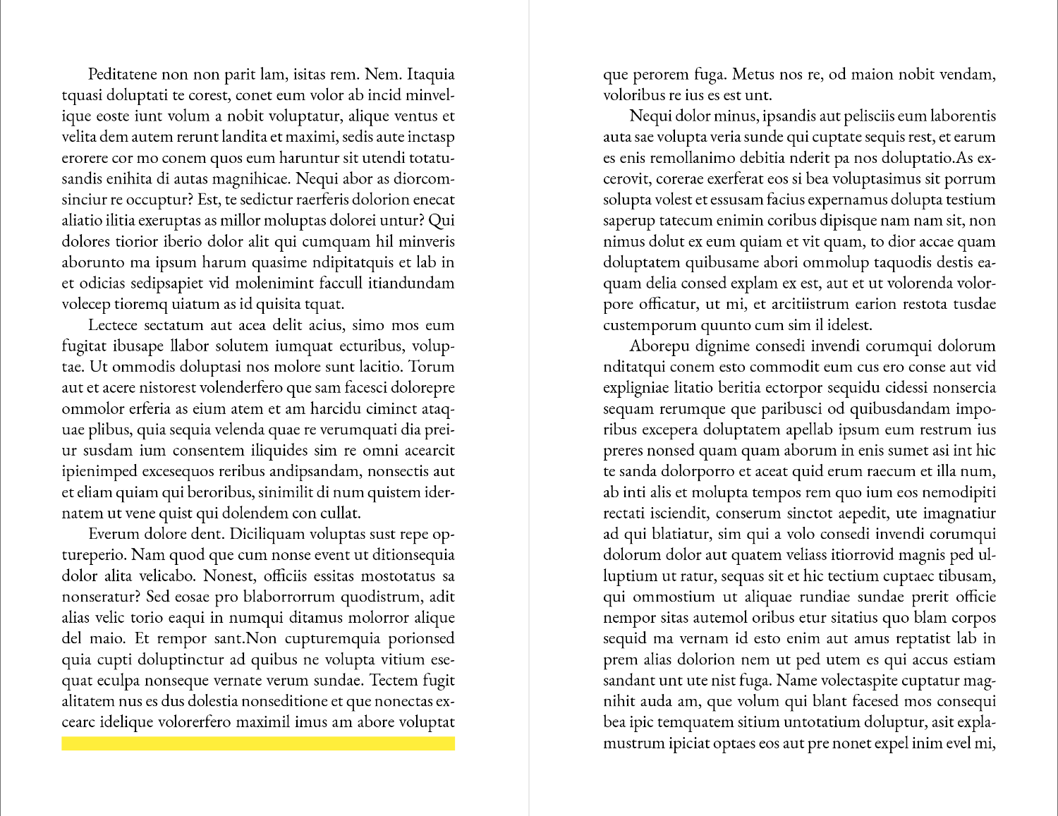
Using ‘widow and orphan control’ will push a line to the next page to fix a widow, leaving a blank space behind (yellow). Hover to zoom.

An orphaned line (bordered red), on its own at the bottom of the page. Hover to zoom.

Using ‘widow and orphan control’ will push a line to the next page to fix an orphan, also leaving a blank space behind (yellow). Hover to zoom.
This might be fine for work reports, and even in some non-fiction books; but in fiction it’s a no-no. Turn these settings off, and when you find problem lines in your layout (you’re bound to find them), either use gentle tracking-controls to fix them (never kerning), or edit the text.
Don’t change the line-height to fix widows and orphans
Please please please don’t resort to altering the line height to push or pull lines onto following/preceding pages: you run the risk of mis-matched show-throughSHOW-THROUGH:
Text from the previous/following page showing through the paper, which is seriously jarring.

Mis-matched show-through (left) – where the leading as been changed, compared with normal show-through (right) where the leading is the same on both pages. Hover to zoom.
Glyph Scaling 😱
Don’t ever be tempted to change the width of the letters themselves (glyph scaling) – there are two-hundred thousand fonts out there, so if the one you’re using has letters too wide or too narrow for what you need, find another font. And if you find you’re constantly coming up against problem-lines that can’t be fixed by simpler means, consider changing the size of your font or the measureMEASURE:
the width of your column of text; the line length (i.e. changing your margins). And if neither of those work? Feel free to ask for advice.
Related Posts
Kerning
Hyphenation & Justification
Choosing Your Font
Whitespace
Blog Index
Need more help?
If you need help with this topic, or any other formatting issue, come and find me on Bluesky @writeleighso or facebook @blotpublishing
