100% written by a human 
Whitespace

Leigh Forbes
One request I get a lot when designing print books for indie authors is, could I please fit everything into the smallest amount of space to keep the page-count down? This is an understandable desire, especially given the recent rise in printing costs, but to cut your page-count, you have to cut margin sizes, shrink fonts and letter-spacing, reduce line heights… it’s a decision that can backfire.
In early ebooks, for example, readers had no control over how the text looked on the page – the layout was entirely in the hands of the people who programmed the text: the designers. But not many early ebooks were designed with even the average reader in mind, let alone those who needed greater accessibility. A quick google of old forums reveals the frustration amongst early ebook-adopters, including the worrying number who simply put books aside because the text was too small – it slowed down their reading, they said, made them squint, and/or gave them a headache (on more than one level). Modern devices now give a lot of layout control to the reader; but of course print books do not. And it’s precisely because readers of print books don’t have the luxury of making typographical choices, that it’s vital to accommodate as many folk as possible when designing your layout. And that means… the judicious use of whitespace.
As a writer, you put weeks, months, maybe years into making your book good to read.
Now you need to do that as its designer too.
Whitespace (or white space) is – in a metaphorical sense – all around us: it’s the space between everything, the space that allows us see the detail, any detail. Imagine lying on your back under a tree, and looking skywards. Do you see the shapes made by the gaps between the branches? That’s whitespace. It’s those gaps that reveal the patterns between the branches. In an opposite scenario, imagine an art gallery with the paintings butting up against each other, no wall space (or whitespace) – between them? Each picture is lost in the jumble. It’s overwhelming.
On a page of text, whitespace appears most obviously around the margins; but it also separates the lines, and the words, and the letters. It also exists within the letters – the hole in an o, for example, or that tiny triangle in a capital A – it’s this level of whitespace that makes different typefaces more or less readable. Unless you have problems with your vision or visual processing, you’ll probably find too much whitespace annoying – no one wants to be turning the page every few lines – but text with too little whitespace (like fifty paintings on the same wall) it’s just clutter.
Taken to extremes, 100% whitespace = a blank page, and 0% whitespace = a page of ink. In either case, you can’t see any letters: no words, no lines, no story. Nada. And the closer you get to either of those extremes, the less your words – your story – stands out, and the more readers will abandon it. Somewhere in the middle, amidst the juggling of typeface, font-size, font-weight, line-height, kerning, tracking, and margins (et al.) is the perfect balance.
Are you still with me? Starting to struggle? I’ll say it again: the more effort you have to put in to reading, the less likely you are to read for long periods at a time, or to pick a book up again after you have put it down. Which means that books with teeny-tiny text becomes the one you keep in the car, for emergencies only: your Emergency Book. And how often do you reach for that?
Is this better?! You probably didn’t notice these font settings in the first paragraph (which is the point of good typography); but I hope you notice, and value, them now. Let your cover stand out, for sure – let it be eye-catching and beautiful (your chapter headings too, if you like) – but not the design of your body text – that should be as unobtrusive as possible, so folk can concentrate on what you’ve written. Unless you’re doing something clever with your typography¹, readers shouldn’t notice your layout at all; it’s a tool to carry the words, that’s all. If readers do notice it, there’s something wrong with it – and that ‘something’ is almost always a lack of whitespace.
Whitespace is to be regarded as an active element, not a passive background.
—Jan Tschichold
¹ For interesting typography in modern fiction, check out a print version of John Lanchester’s The Wall.
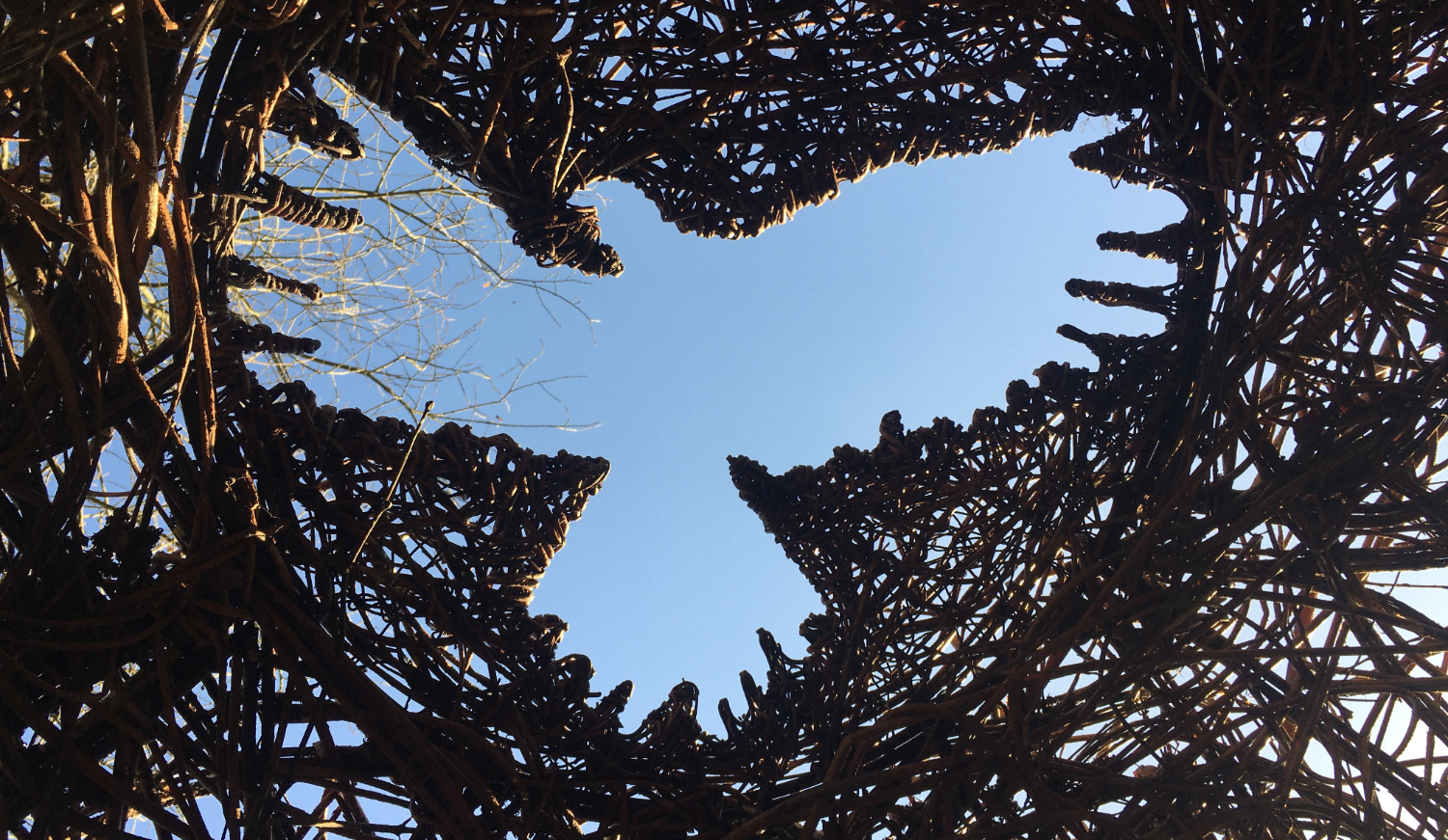
A beautiful use of whitespace in this hawk-shaped hole, woven into the roof of the
Willow Sphere, at Arundel’s Wildfowl and Wetlands Trust reserve (West Sussex, UK).
Photo credit: Leigh Forbes
Related Posts
Choosing Your Font (layout)
Hyphenation & Justification (layout)
Tracking (layout)
Kerning (layout)
Readability (layout)
Blog Index
Need more help?
If you need help with this topic, or any other formatting issue, come and find me on Bluesky @writeleighso or facebook @blotpublishing
