100% written by a human 
All About Quotation Marks

Leigh Forbes
Overview
Whether you’re publishing fiction or non-fiction, the chances are you’ll be using quote marks at some point, and as different typefaces display them in different ways, have a think about how their appearance matters to you (if at all), before you choose your font. If it does, also pay attention to vertical balance (see PT Serif) and horizontal spacing (see Charter’s closing quote). Also be aware that free fonts are often not well-designed in this respect.

A selection of differently styled quote marks for common serif typefaces.
Smart (curly or typographical) quotes
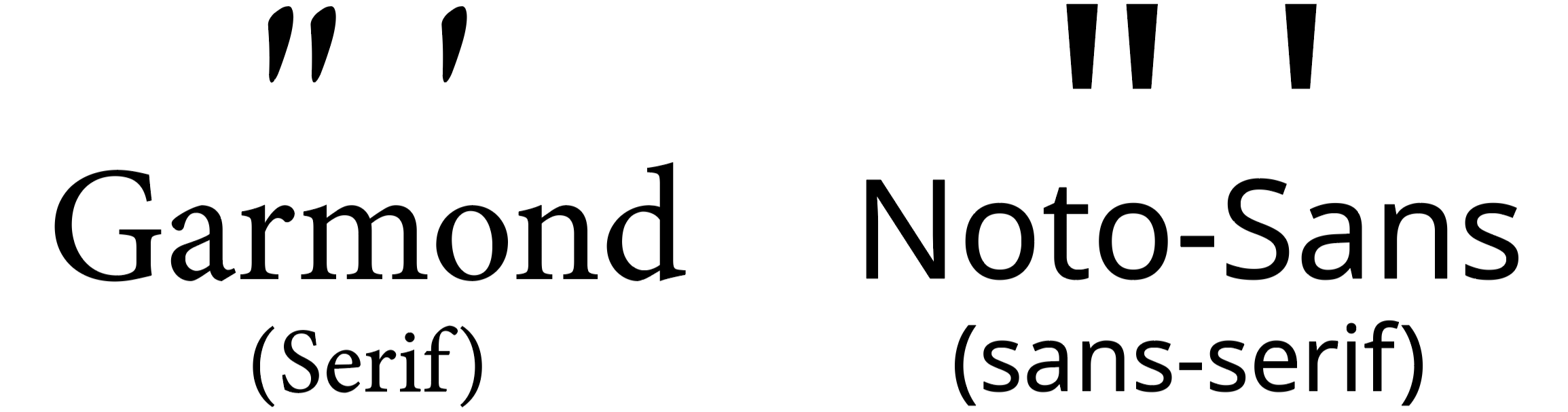
Curly quotes are smart, because – depending on whether they are opening or closing quotes – they are left- or right-handed; traditionally remembered by generations of schoolchildren as 66 (opening quotes) and 99 (closing quotes). This distinction is much less clear in sans-serif typefaces.

The clearly 66/99-shaped serif quotes of Garamond, and the much subtler varied-stroke-widths of Noto-sans.
Although I always used to prefer double quotes, singles take up less (sometimes critical) space, and are much more widely used now. But whichever you chose as your main quote (either single or double), use the other style (double or single) when you have a quote within a quote, or a quote within dialogue.
- Anita sighed. ‘He told me, “never again”. Those were his exact words.’
Dumb (straight or neutral) quotes
In the typewriter era, there wasn’t enough space on the keyboard for different styles of quotation marks, so double quotes were straightened and (losing their left- and right-handedness), and single quotes were made using a straightened apostrophe. Not pretty.
With dumb/straight quotes, it’s no longer possible to tell which is opening and which is closing.
Many writing apps have an option to convert quotes from straight to curly (or back), either as your type, or on existing text. Be mindful though – sometimes closing quotes following ellipses or em-dashes will be converted to opening quotes instead, so check these if you make a global change.
Dumb quotes are still useful if you are wanting to replicate a typewriter style:
"MURDER, SHE WROTE"
Primes
Primes are not the same as dumb quotes (despite what you might see elsewhere), although, again, in sans-serif typefaces, it can often be hard to tell the difference, even with smart quotes. Yes, primes are straight (like dumb quotes), but they’re also slanted top-right to bottom-left.

Noto-Sans’s rendering of primes (left), smart opening single/double quotes (middle), and dumb/straight quotes (right)
Primes are used as unit markers for:
- Feet ( ′ ) and inches ( ″ ):
He stood at 6′ 5″ in his stockinged feet. - Minutes ( ′ ) and seconds ( ″ ) of arc (units of angular measurement use, e.g. in astronomy):
There are 60′ in 1°, and 60″ in 1′
Recap
| Smart Quotes ( “ ‘ ’ ” ) | Dumb Quotes ( ' " ) | Primes ( ′ ″ ) | |
|---|---|---|---|
| Uses include | Opening and closing dialogue Indicating quotations |
Typewriters Programming And nothing else |
Seconds and minutes of arc Feet and inches |
| Where to find them? | Your software will have a default style for quotes (either straight or curly), but you can toggle between them using “convert to curly / straight quotes” (or similar). To force curly quotes (e.g. on social media), use: “ (double opening) = opt + [ ‘ (single opening) = opt + ] ” (double closing) = opt + shift + [ ’ (single closing) = opt + shift + ] |
In MS Word: click Ω in the toolbar > “more symbols” Or Mac: Ctl + ⌘ > and type in “prime” for options PC: Start > All apps > Windows Tools > Character Map |
|
Related Posts
Choosing Your Font (layout)
Tracking (layout)
Kerning (layout)
Readability (layout)
All About Slashes (punctuation)
All About Dashes (punctuation)
Punctuation & Other Squiggles (punctuation)
Blog Index
Need more help?
If you need help with this topic, or any other formatting issue, come and find me on Bluesky @writeleighso or facebook @blotpublishing
